Portfolio guide
The Numbers on Your Insights Page
Three figures sit at the top of Insights, and every other panel explains one of them. This guide covers what each counts, how they relate, and why they move when you change a filter.
The three headline figures
The numbers on the screenshot match the list below it.
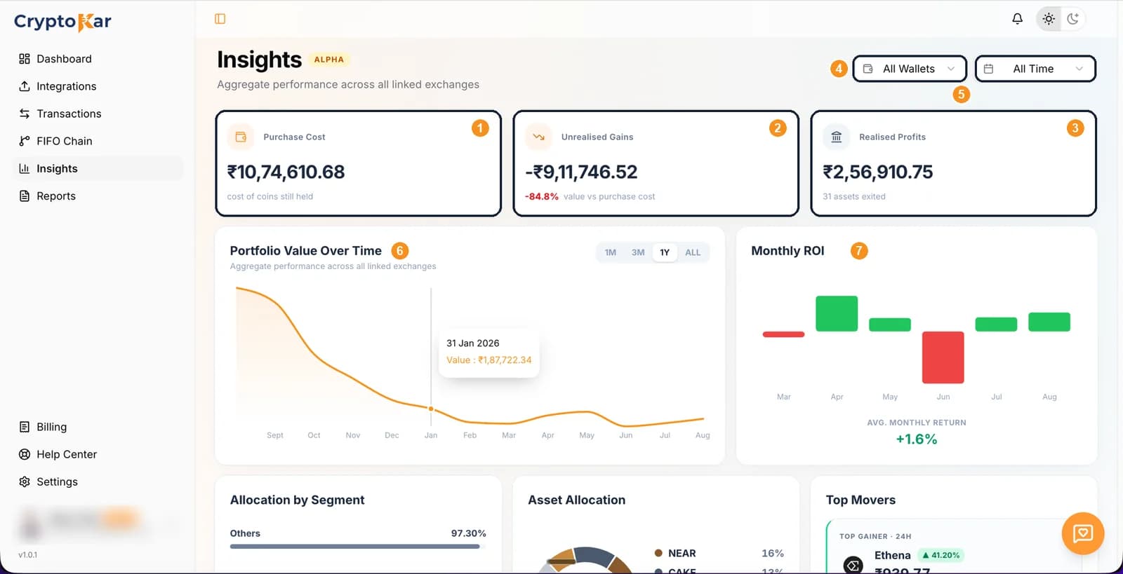
- Purchase Costcost of coins still heldWhat you paid for the coins you have not sold, taken from the FIFO lots still in your inventory. Sell a coin and its cost leaves this figure, because it is no longer a coin you hold.
- Unrealised Gainsvalue vs purchase costToday's value of those same holdings minus what they cost. The percentage beside it is that difference over the purchase cost. Profit on paper, and nothing here is taxed until you dispose of the coin.
- Realised ProfitsN assets exitedGains and losses already banked, summed across every disposal in view. The note underneath counts how many assets you have exited completely.
How they fit together
One coin passes through both sides. While you hold it, it sits in purchase cost and its movement shows as unrealised. The moment you sell, it leaves both and lands in realised profits.
Following one coin
- Buy 1,000 CAKE for ₹30,000. Purchase cost rises by ₹30,000.
- It is worth ₹21,000 today. Unrealised gains show −₹9,000, or −30%.
- Sell the lot at ₹21,000. Purchase cost falls by ₹30,000, unrealised drops the −₹9,000, and realised profits record the ₹9,000 loss.
- Only that last step touches your tax report, and a VDA loss cannot be set off against another coin's gain.
Wallet and year filters
- All WalletsNarrows every figure on the page to one exchange. Purchase cost, unrealised gains and holdings then describe that account alone, which is why the numbers drop when you switch from All Wallets to one venue.
- All TimeNarrows to one financial year. Holdings are valued as they stood at that year's end rather than at today's price, so an old year keeps reading the way it did then instead of being rewritten by this week's market.
The charts underneath
- Portfolio Value Over TimeWhat your holdings were worth across 1M, 3M, 1Y or ALL. Hover any point for the value on that date. The line follows both your trading and the market, so a fall can mean you sold or simply that prices dropped.
- Monthly ROIReturn per month as bars, with the average monthly return underneath. Green is a positive month, red a negative one, and the sign on the figure says the same thing.
Allocation by Segment
How your value splits across categories, so you can see the weight sitting in one kind of asset.
Asset Allocation
A donut of your holdings by coin, with the share each one takes and the total number of assets in the middle.
Top Movers
The biggest gainer and the biggest loser over 24 hours, with the percentage each moved.
Where prices come from
- Live rupee prices come from CoinGecko and refresh about once a minute while the page is open.
- When the price source is unreachable, the last good price is used and marked stale rather than the value vanishing.
- A coin with no price at all is left out of the value figures instead of being counted as zero.
- Your exchange quotes its own book, so small differences against the app are normal.
When a figure looks properly wrong rather than slightly different, work through when your portfolio looks wrong.
Frequently Asked Questions
What people ask when the three cards do not add up the way they expect.
CryptoKar calculates your tax from the transaction data you import. Review your report before you file. If you have questions about your tax situation, speak with a qualified tax professional.
Last updated 21 August 2026
Calculate Your Crypto Tax
Import your exchange data and get started. Supports CoinDCX, WazirX, Binance and Bybit.